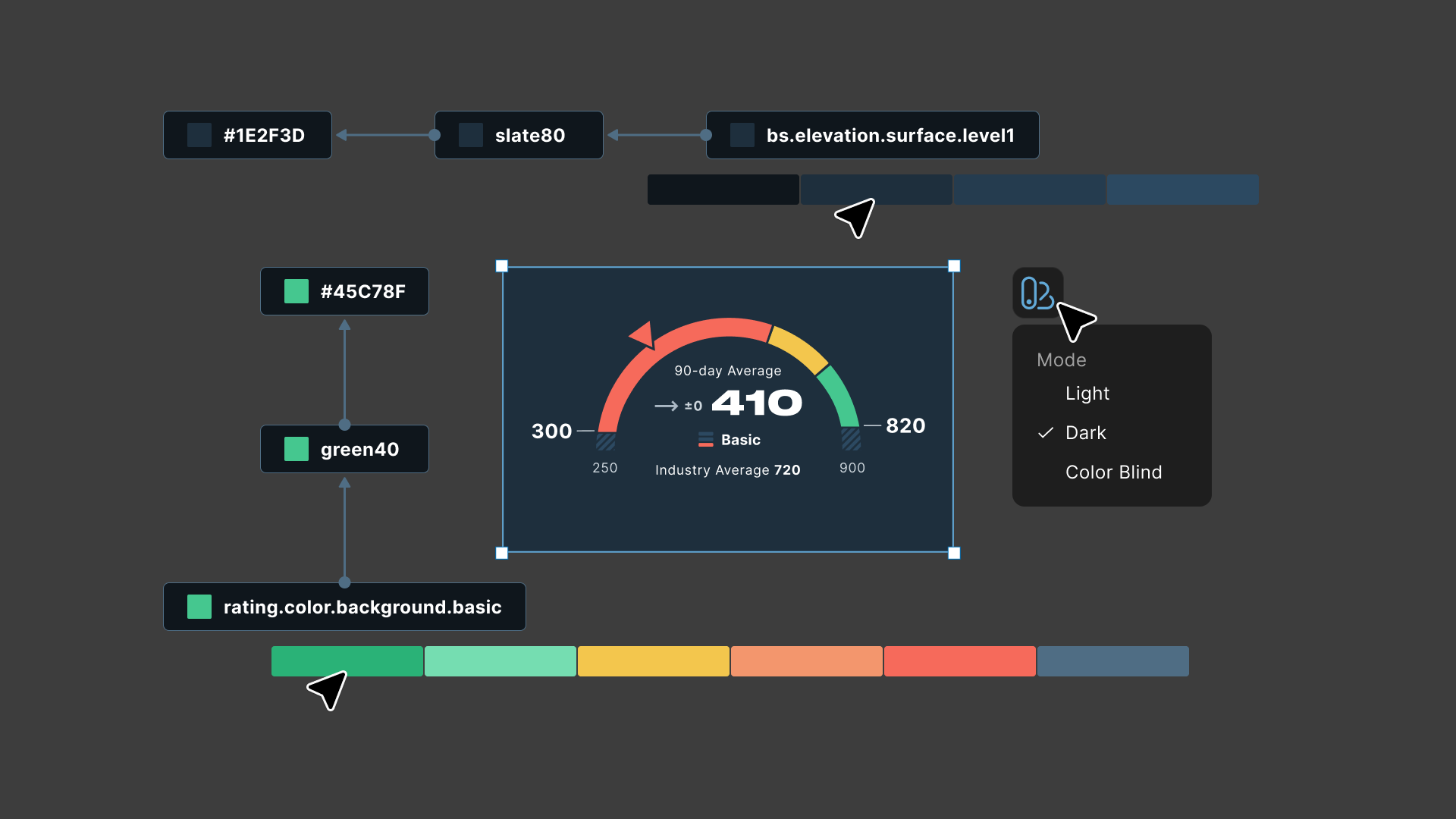
At Bitsight, the design team worked from Figma styles, not tokens. The platform already had a light/dark toggle built, so designing a component meant designing it twice, once per theme. I led the adoption of a semantic token system that replaced that manual process, cutting design time per component by 40% and improving product consistency.
A Figma announcement, a rebrand, and a window of opportunity
In mid-2023, Figma announced Variables at their annual Config event. I watched the presentation and felt something click. This wasn't just a new feature. It was an answer to a problem I'd been sitting with for a long time. How do you make visual decisions consistent across a growing product without relying on manual discipline?
The timing couldn't have been better. Bitsight was undergoing a company-wide rebrand. Every product interface would need to reflect new visual standards across multiple platforms. Without a scalable solution, that rebrand risked becoming a slow, error-prone process that would stretch for months.
I saw the rebrand as an opportunity to build the system underneath it properly, so the next rebrand, or the next acquisition, wouldn't cost us the same effort all over again.
I proposed starting with a proof of concept. The Questionnaire feature, which I was already leading as a designer, became the first real test ground. It spanned both the VRM reviewer experience I owned and TMH, which I knew well from my earlier work on ThirdPartyTrust, making it a good test for a token system that needed to hold up across different teams. The POC worked, and I got the green light to bring it to the design system properly.
The challenge of keeping consistency while everything changes
The product suite was growing through acquisitions and new features, but our visual foundation wasn't growing with it. Design worked from Figma styles, and that meant a system that didn't scale. Consistency was the product of a manual process that depended on designers' memory and attention.
The challenge was maintaining consistency while everything around it kept changing.
Products were added and acquired regularly. Legacy interfaces couldn't be replaced overnight. Visual updates were often driven by perception: "make it feel more modern." Changes needed to scale across many surfaces at once. We needed a system that could absorb change, not resist it.
My goal became making updates cascade instead of rippling into chaos, and making consistency the default outcome, not the result of a manual review cycle.
Learning from what already existed
Before designing anything, I audited the existing style system and looked at how other teams had solved similar problems. That let me identify usage patterns, inconsistencies, and opportunities for improvement.
I also studied three design systems as reference points:
Their token naming structure, foundation.property.modifier, became the backbone of our semantic layer. It gave us a consistent, readable pattern that any designer or engineer could follow without a reference doc.
Their contextual token approach (tokens scoped to specific UI surfaces) influenced how we thought about namespacing contexts like nav or specific scales like riskVector. The class segment was inspired by this system.
Too large in nomenclature for our scale, but useful as a reference for how far a token system can go when the product demands it.
All three were well-designed, but their scale and nomenclature often didn't fit Bitsight's context. When I tried mapping their structures directly onto our products, the cost of adapting them outweighed the benefit, so I kept what was useful from each.
The token architecture
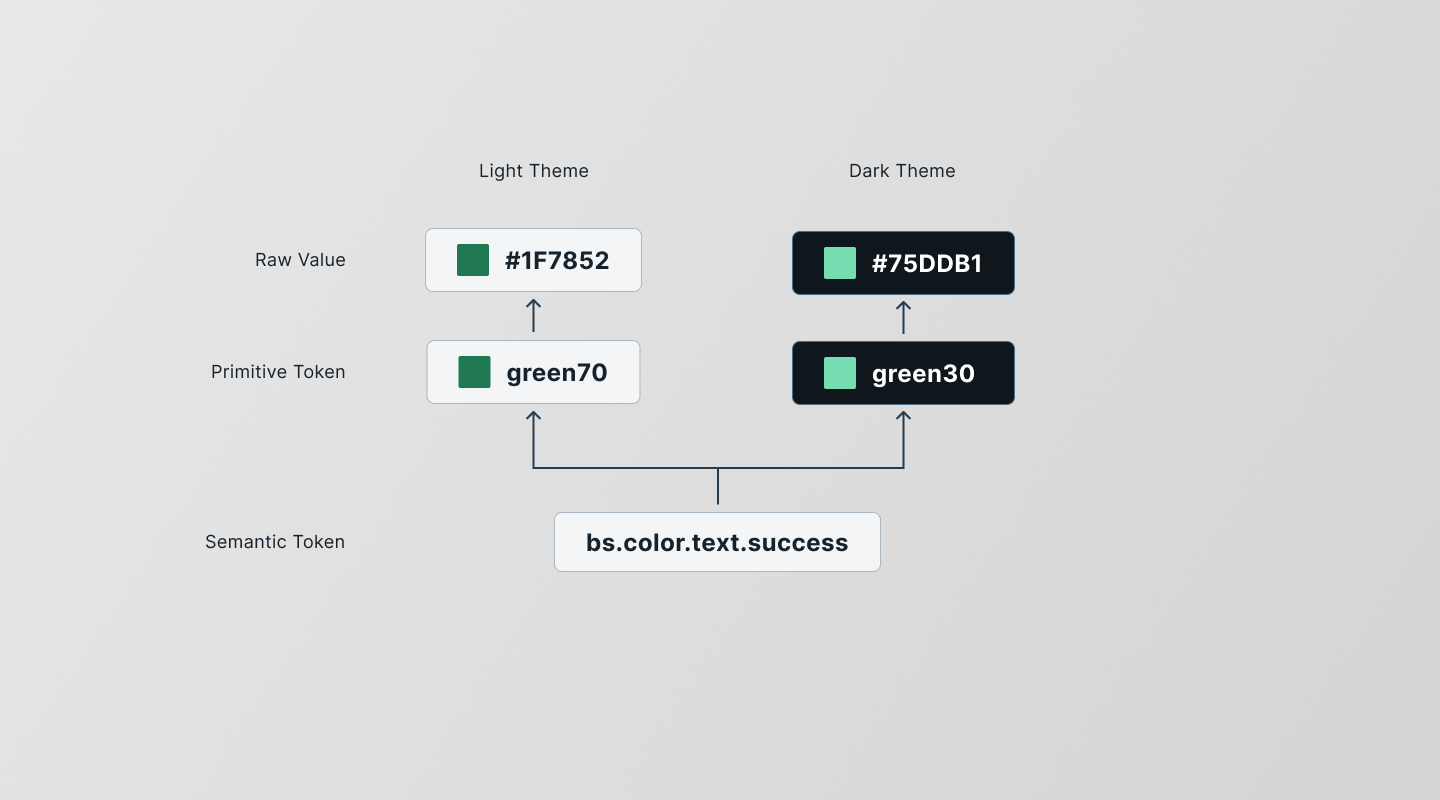
A semantic token references a primitive. The primitive holds the raw value, never consumed directly by components.
The system is built on two layers. Primitive tokens hold raw values with no opinion. Semantic tokens carry meaning, context, and purpose. Every semantic token follows a naming convention, and that convention became the foundation of the system.
Raw values with no interpretation. These tokens name a value but don't assign it any meaning or context. They're the foundation everything else references, never consumed directly by components.
Tokens with purpose and context. Every semantic token carries meaning, context, and purpose. These are the tokens components consume, and the ones designers use to build the interface.
The naming convention:
A design token's name describes how it should be used, and follows the same four-part structure. Any designer or engineer should be able to infer what a token does just by reading its name.
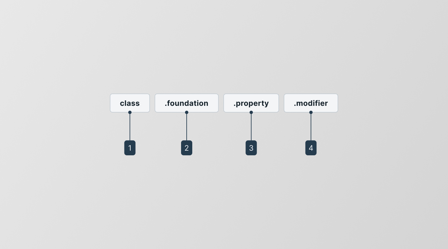
The four-part naming convention: class · foundation · property · modifier.
Groups tokens that belong to a specific UI context or product concept, whether that's the default design system, a navigation surface, or a scale like risk ratings.
The type of visual design attribute the token controls, such as color, elevation, or space. It answers what kind of style the token belongs to.
The UI element the token is applied to, such as a border, background, shadow, or other property. It shows what gets styled.
Additional details about the token's purpose, like its color role, emphasis level, or interaction state. Not every token has a modifier. color.text, our default text color, doesn't need one.
Token class:
The class segment is the first part of every semantic token name. It signals which UI context the token belongs to. Not every context needs one, but when a context has its own styling rules, that's when it's worth isolating it in its own class. That prevents accidental overrides and keeps intent clear.
The default namespace for all tokens. Everything that doesn't belong to a specific context lives here, things like typography, spacing, or core UI colors. Example: bs.color.text.primary.
Domain-specific color systems for Bitsight's cybersecurity grades, risk scores, and security findings. Each one gets its own class. Example: riskVector.color.background.gradeA.
The nav bar doesn't switch between light and dark mode. Isolating it in its own class makes that behavior clear and prevents accidental overrides. Example: nav.color.background.logo.
Switching themes across token classes in Figma: the nav bar doesn't change between light and dark, while the rest of the interface does.
riskVector... and the value is right there.
The class segment was the key decision. Rather than trying to make one universal token set cover everything, we accepted that some contexts, like our cybersecurity rating scales, were different and deserved their own namespace.
Sizing tokens: changing personality without changing components
One of the most satisfying demos I ran for the team was showing what sizing tokens could do. Swap radius values, adjust density, change component height, and the entire product shifts its personality. Compact and sharp vs. spacious and soft. No component was redesigned. Only the tokens changed.
Swapping radius and density tokens shifts the product's visual personality. No components were rebuilt.
Elevation tokens: a system that didn't exist before
Before the token system, elevation and surface had no documentation at all. Elevation was just a judgment call made component by component, with no shared reference and no rules.
Defining elevation tokens made us stop and actually decide what the system should be.
Elevation tokens
The final system uses five tokens. Four surface levels cover the full range of depth in our UI. One blanket token handles the overlay state used by dialogs, drawers, and modals.
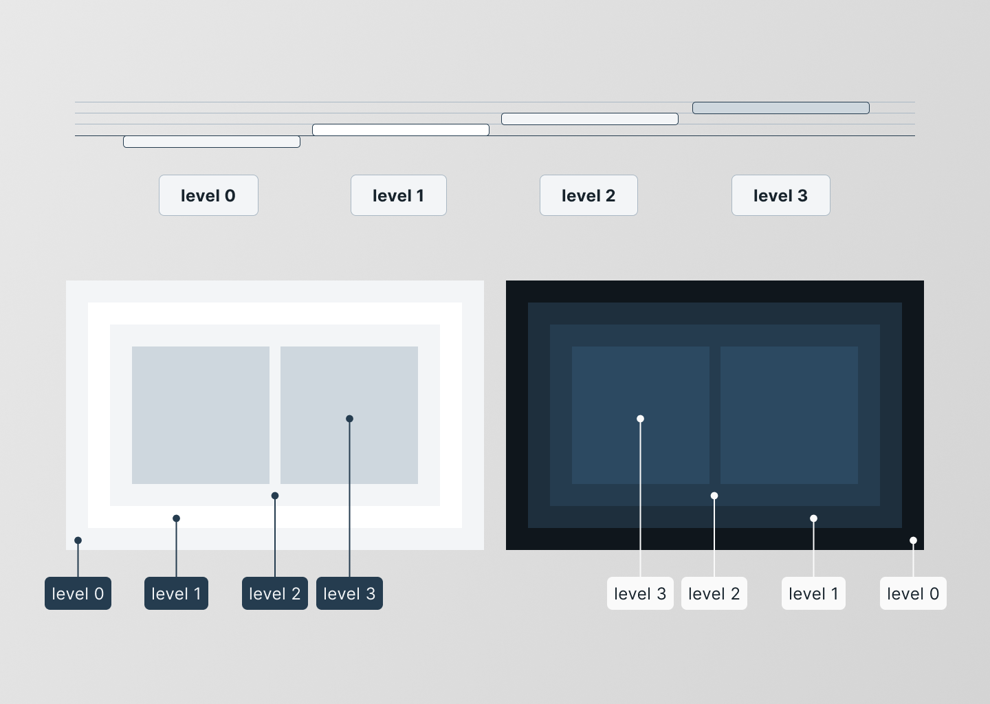
Four surface levels cover the full range of depth in the UI.
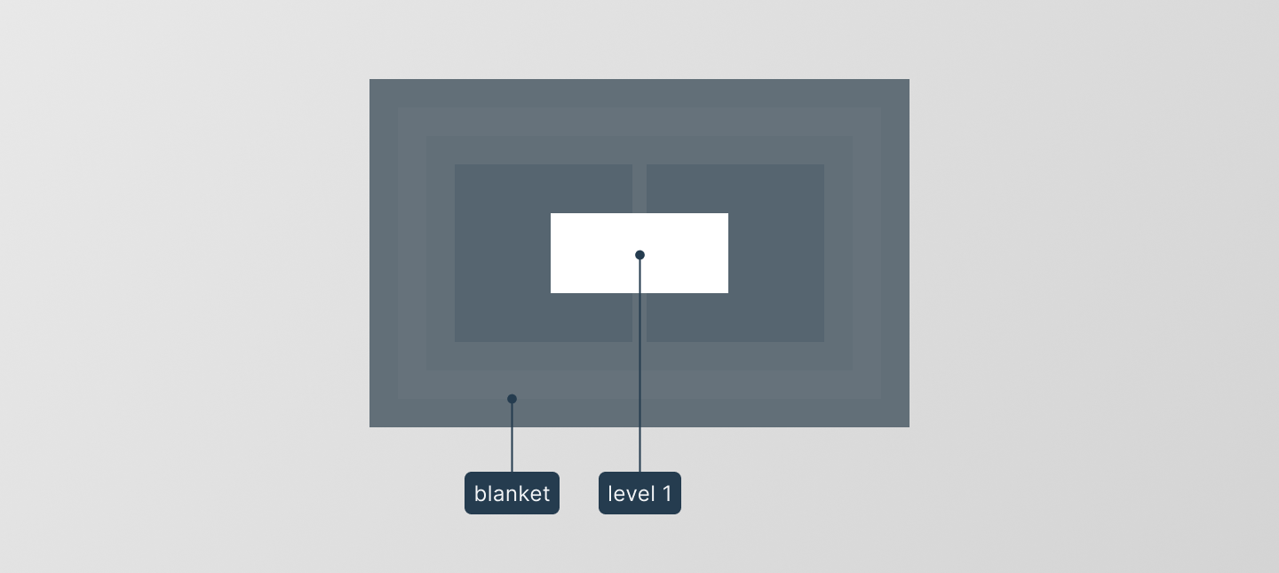
The blanket token handles the overlay state: dialogs, drawers, and modals.
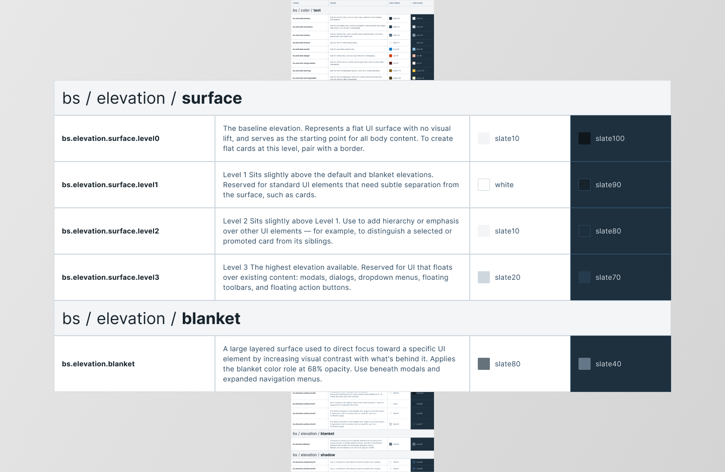
The complete elevation token set: name, value, and intended usage for each level.
Having these tokens in place means that any new component that introduces depth only has to pick a level.
Consistency that scales
The token system shipped progressively, starting with color tokens, then spacing and typography. At launch it covered 160+ primitive variables and 100+ semantic tokens. The effect was visible immediately: updating a primitive value cascaded automatically to every semantic token that referenced it.
What used to take days (designing two versions of every component for light and dark mode, hunting for the right hex value, manually keeping everything in sync) was reduced to minutes.
Before tokens: two components, one purpose
Before the token system, supporting light and dark modes meant designing two separate versions of every component (two sets of colors, two frames). Every design change meant updating both components, and keeping them in sync was a manual, error-prone process.
With tokens, that disappeared. Components referenced semantic tokens, and switching modes meant switching the token set, not rebuilding the component.
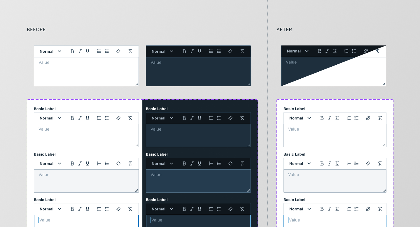
Before tokens: two separate component versions for light and dark. After: one component, one token switch.
Tokens and accessibility
One of the pain points in our product was the scale color system. Bitsight used red for the undesirable end of a risk or grade scale, and blue for the desirable end. After a rebrand, blue was replaced with green, closer to the red-to-green convention most people expect from a risk scale. That fixed one problem and created another. Red and green are one of the hardest combinations for color blind users to tell apart, which made it an accessibility problem.
As a fix, I proposed an alternative set of tokens for color blind mode. It was never implemented, but it proved switching modes needed no changes to components, only new tokens.
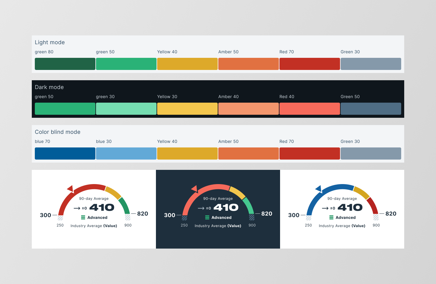
Color blind mode (proof of concept): same semantic tokens, an alternative primitive set of accessible colors.
This was a direct result of the token architecture. If colors had been hardcoded, adding an accessible mode would have required designing a new set of components for each scale. With tokens, all it took was one set of alternative primitive values.
The users were my teammates
This project reminded me of the first design system I designed at ThirdPartyTrust. The users were my teammates, and me.
I got to see the reactions in real time, in weekly syncs and in Figma comments. There's something different about designing a tool that makes your colleagues' work easier, or seeing their face light up the first time they switch a mode and the whole interface updates in one click.
Lessons learned
Studying mature systems helps, but don't force their structure onto your own. Carbon, Material, and Atlassian were a good place to start, but I should have stayed open to changing the naming earlier. It took several iterations to land on a naming convention that worked for our context, and that delayed the project.
Our early conversations with the engineering team were open. They wanted the same consistency and alignment I did, and that willingness told me we were on the right track. I left Bitsight after a company-wide layoff, before the design system could close the gap with engineering's, so I can't include those results in this case study.